Showing posts with label Two Peas in a Bucket. Show all posts

Saturday, November 12, 2011

4x6 Photo Love, October

Pin It
Pin It
This month for Shimelle's 4x6 Photo Love class she had us use page protectors that were divided. I used one that came with my Doodlebug album that has three divided 4x6 landscape slots and one large slot that is 6x6 inches. Since I print my pictures as digital prints my photos are a smidge smaller than 4x6. Therefor I matted the landscape photos before placing them in the slots. For the four portrait photos I placed them on a 6x6 piece of woodgrain cardstock and highlighted it with a strip of forest creature cardstock I bought ages ago because the fox on it reminded me of my dog. I'm glad I finally got to use it!

Pin It
Pin It
Pin It
Pin It
All the little critters on the landscape photos are from three sets of Lawn Fawn stamps. I stamped them in momento ink, Copic colored them, cut and paper pieced here and there. The three Lawn Fawn sets I used were Critters in the Forest, Critters in the Burbs, and Bannerific.

Thanks so much for stopping by and thank you everyone who leaves comments, you're all so sweet!

Inky and glittery fingers for all!
-Gaby

Thursday, November 10, 2011

Interactive Christmas Card

Pin It
Pin It
Pin It
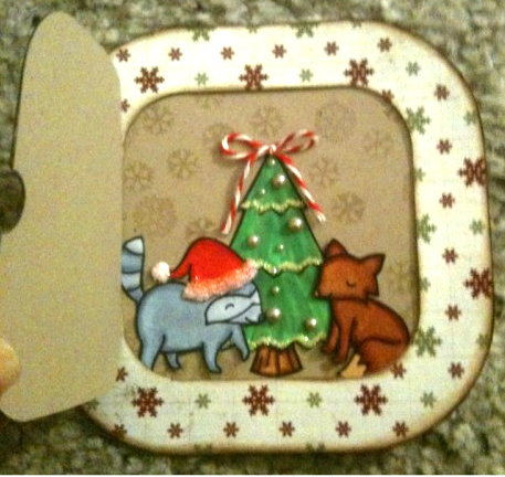
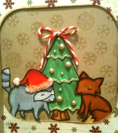
Well we all know how much I love Lawn Fawn stamps ...so when I saw the new challenge at Two Peas for Lawn Fawn Christmas cards, I couldn't resist! I made an interactive Christmas card with four of their stamp sets. The "door" with the wreath is the top layer of my card and for that I used Lawn Fawn's Bows and Holly stamp set. Inside the door I used their Critters in the Forrest for the tree, the raccoon, and the fox. The Santa hat is from their Hats Off to You set. The snowflake background I stamped in Versa Mark on the Kraft paper is from one of their newer sets, Making Frosty Friends.

I cut the card on my Silhouette, but made a couple modifications so that the door was different from the frame on the front and that the inside would be kraft so that it would be easy to write on. Everything was colored in with Copics and paper pieced. Heaps of Stickles were used and plenty of bling and pearl bits were also used.


Pin It
This last picture is just to show you that you can have an interactive card and still have the same amount of room to write a note inside as you would a regular card. You can also substitute the Christmas tree with the animals inside and instead adhere your family photo for holiday cards. The possibilities are endless with this type of card! :)

Thanks so much for stopping by and if you have any questions please don't hesitate to ask.

Inky and glittery fingers for all!
-Gaby

Featured on Fawny Flickr Friday's Blog on 11/18/2011. :)

Monday, November 7, 2011

T is for Tim Holtz

Pin It
The second part of the "T is for" challenge at Two Peas includes Tim Holtz. I first embossed some snowflakes on the Tim Holtz blue paper in silver, gold, and blue embossing powders.

Pin It
I made the snowman from Tim Holtz's Bigz die out of grunge board and grunge paper. I painted his body white with the snow cap paint dauber, his top hat black with the black paint dauber, and his nose orange with the orange paint dauber. Then I sanded the hat a smidge and added Vintage Photo distress ink to some of the bits I sanded off. For the charcoal eye I took one of Tim's long brads and held it with a tweezer, dipped it in Versamark, then sprinkled with black embossing powder and heat embossed it. Please make sure you use tweezers for this step, the brad gets extremely hot! I bore a hole through where I wanted the eye with Tim'z poker tool and placed the brad. I glued all the bits together with glossy accents and adhered it to my page. Lastly I ran a sheet of plastic through Tim's snow embossing folder and set it over the snowman with Tim's brads and washers.

I painted the die cut snowflakes with paint daubers and let them dry. Then I went over the edges with different blue distress inks. Adhered them with glassy accents to the page. All the white snowflakes are Jolee's stickers. I edged the adage ticket with Vintage Photo and stuck it down with Tim's Charm Clips. This was a very simple page, well except for the snowman. I actually didn't want to make it too complicated so that the snowman could shine a bit more.

Thanks for stopping by and if you'd like any more info, please let me know!

Inky and glittery fingers for all!
-Gaby

Sunday, November 6, 2011

T is For ...

Pin It
My entry to Two Pea's, "T is for Tone on Tone" challenge. I used two Lawn Fawn stamp sets: Bannerific and Sophie's Sentiments. The butterfly and flower stamps are from Close to My Heart. The banner has thick foam adhesives behind it and the butterfly has a slightly thinner foam adhesive behind it. I colored everything in with Copic Markers and paper pieced them down. The butterfly and and the daises have Doodlebug gems in the centers. Once everything was in place I took a piece of green vinyl ribbon from BoBunny and cut it up haphazardly with plain ole scissors. However, if anyone has a spare set of the Martha Stewart fringe scissors I will gladly accept them! After I got it just right I drew lines with four different green Copic markers to make faux blades. Since the Copics are alcohol based, they work perfectly on the vinyl. Lastly I drew in a swirl from one of the flowers to the butterfly by making dots with a Sakura Gelly roll black pen and did the faux stitching with a opaque white gel pen.

Pin It
Here's the side view, because everyone needs a side view!

Thanks so much for stopping by!

Inky and glittery fingers for all!
-Gaby

Saturday, October 29, 2011

Mixing different letter stickers/thickers on a layout.

Pin It

Photobucket
Pin It

Two Peas is having an event called, 14 Days of Tricks and Treats. Each day they come up with a different "trick" to use in paper crafting and award a treat to one of the Peas who comment on the daily posts. For day 11 they asked you to mix up your title by using different stickers and thickers rather than just using one type. On this layout I used some Amy Tangerine thickers, October afternoon rocket age letter stickers, and some Sassafras letter stickers from a past Studio Calico kit. This is a great technique to use when you're running low on letters from different sets.
Photobucket
Pin It
Photobucket
Pin It

For the overall layout, I just cut a bunch of random papers, journaled and stamped on two tags, and attached some Studio Calico chipboard butterflies. The super cute orange heart and camera sticker by the title is from Amy Tangerine for American Crafts. After everything was adhered I masked off the pictures and misted the whole page with Perfect Pearls mist.

Thanks so much for stopping by and checking out my blog post!

Inky and glittery fingers for all!
-Gaby

Monday, September 12, 2011

Products you love every which way, September.

Pin It

Here's another entry for the Products you love every which way class from Shannon Tidwell. This month's class at Two Peas In a Bucket focuses on tapes. There's tissue tapes, washi tapes, cotton tapes, canvas tapes, embossed masking tapes, and I'm sure many other decorative paper crafting tapes I didn't mention. For this layout I used Prima's Bare Canvas tape, Tim Holtz's Tissue Tape, and Amy Tangerine's by American Crafts Mixed tape (haha, get it? so cute!).

Pin It

First I cut down a piece of kraft cardstock by taking an inch off of two of the four sides. Then I took a ruler and made a crisscross pattern kind of like the top of a pie with a pencil. I misted the kraft with some Tattered Angels glimmer mist in Bahama Blue, then misted over that with a layer of Studio Calico Mr. Huey's Cream mist. After I let it dry I started adhering Tim Holtz's Tissue Tape diagonally up one side and back down the other to form that pie pattern crisscross I had sketched out in pencil. After that was all finished I inked the edges with Vintage Photo Distress Ink and adhered it to a 12x12 sheet of plain Kraft.

Pin It

On my journaling tag is where I added the other two tapes. First I stamped out the lines on the tag with Lawn Fawn's Schoolhouse Backdrops. After that I used Amy Tangerine's Mixed Tape in the woodgrain pattern to the edges of the tag. Once I got that all stuck down how I liked it, I rolled out a piece of Prima's Bare Canvass Tape and stamped out Folly Beach using Lawn Fawn's Sally's ABC stamps and brown StayzOn ink. All I had to do after was peel off the backing and stick it on the tag as my title and fill in my journaling.

After all my tissue tape adventures I added some other embellishments and a title. The title is silly, I know. Ever since I heard that the storm was named Irene I couldn't get the song, 'Come on Eileen' out of my head. It probably doesn't help I was listening to Save Ferris (one of my favorite CDs from high school) the week before. I kept saying it sarcastically in my head, "Oh Come ON, Irene!" Hoping we wouldn't have to cut our vacation short to come home to NC to prepare. Sadly we did have to come home early, but luckily we had very little damage. So I'm not complaining!

Thank you so much for stopping by!

Inky and glittery fingers for all!
-Gaby

Tuesday, August 9, 2011

Stamp resist technique.

Pin It


Pin It


I loosely followed Nichol Magouirk's class on stamp resist. By loosely, I mean that I did a small bit of the technique on my lay out, but didn't follow her sketch. Which is totally fine if you want to enter the contest for her class at Two Peas.
I'll start off with the products I used:
-Stampin' Up Calypso Cooler ink pad
-Stampin' Up mini clip
-Tim Holtz Vintage photo Distress Ink
-Versa Mark embossing pad
-Maya Road Kraft doilies
-Bo Bunny Gabrielle papers
-Ali Edwards' Awesome Days of Summer stamp
-Studio Calico cream Mr. Huey spray
-Tattered Angels sand Glimmer Mist
-Studio Calico cream cardstock
-Jenni Bowlin mini calendar bingo cards
-Rocket Age mini market stickers from October Afternoon
-Flower from CTMH Bliss Level 2 assortment
-CTMH Juniper Exclusive Inks® stamp pad
-Martha Stewart double edged scallop punch
-Kraft cardstock
-Mistables scalloped ribbons by Pink Paisley
-Embossing tool
-Ranger white embossing powder
-Ranger blending tool with foam applicator
-Post It notes

Stamp resist is a pretty easy way to bring a nice element to a layout. For this one I stamped Ali Edwards' sentiment on Jenni Bowlin's bingo card with Versa Mark. Then sprinkled on the Ranger white embossing power and tapped off the extra that didn't stick to the Vesa Mark. Starting on the back of the card I lightly heat embossed it and then turned it to the front and finished off the heat embossing. Let cool for two minutes and masked off the edges of the bingo card with post it notes. I dipped my blending tool in vintage Photo Distress Ink and blended it around the sentiment, making it the darkest around the embossed portion and lightly blending the ink outwards towards the Post Its. The embossing part will resist the ink or spray you blend or mist on it, just take a clean cloth and wipe off any that may be laying on top for an extra clean look. Lastly I took off the Post its and edged it with CTMH's Juniper ink.

If you'd like any more information on this LO, please don't hesitate to ask!

Inky and glittery fingers for all!
-Gaby

Friday, August 5, 2011

Summer double page layout featuring rub ons.

Pin It


Pin It


Pin It


Pin It


Pin It


Pin It


I love Two Peas in a Bucket. It's so much more than an online scrap store. They have free classes and tutorials, challenges, members share their projects, there's a forum. Just heaps of fun for any paper crafter!

Each month there's different free classes. I did this layout for the "Products you Love Every Which Way" class which started on July 10th and will end on August 10th that featured rub ons. I'm typically not a fan of rub ons. I always get scared when rubbing them on with the included popsicle stick that I'll miss a part, causing it not to stick all the way and ruin the whole thing. I see rub ons like makeup application. My mom always said to blend your foundation till you think it's perfect, then keep blending more. Only then will it be properly applied and look natural on your face. As with the rub ons, I keep rubbing till I feel it's fully adhered, but then rub more to make sure it really is fully adhered.

These pictures were from a trip down to Myrtle Beach, SC to visit my husband's family while they were on vacation. It was an extra special trip just to finally meet our nephew Max! So this page is heavy on the Max pictures and not so much on the beach. :)

I used Kraft cardstock as my background. I've been using it on almost all my layouts and on a lot of cards, too. I just think it's so pretty, the way it's raw and uncolored. Plus it's awesome because it's made out of recycled paper. On top of the Kraft I put another layer of Kraft that had a black design printed on top of it. I cut an inch off of two sides of my paper and adhered it to the center of the plain Kraft cardstock. The next thing I did was matte all my pictures with Doodlebug's petite prints cardstock in five different colors. This helped bring the Carolina beachy feel to the LO and also matched the slipper (flip flops as most call them) pattern I used in blocks at the bottoms of both pages. All the edges of the papers besides the bottom most Kraft card stock were inked with Stamp'n Up's Calypso Coral. This helped tie all the papers together.

When all the papers were in place is when I adhered my pictures. I didn't really have room for too much of a title, but since the trip was really about seeing Max and I needed to add rub ons for the challenge, I did the title like I did. I cut out a piece of paper from a 6x6 paper pack I won a long time ago in a raffle. The paper had lines on it which made it perfect for adhering my "hello" lagoon rub ons from KI. I also used a friskars punch to punch out the top of the paper to make it look as if it were torn out of a notebook. I edged the paper in Tim Holtz's Vintage Photo Distressing ink and added one of Tim's mini paper clips to the top. I then added the blue Thickers letters to spell out Max! and lastly tied a hemp twine bow around the bottom. I adhered it very loosely so that it wasn't so flat and looked more like it was just hanging there slightly tucked into the slipper paper.

For embellishments I used Doodlebug boutique buttons, October Afternoon's Seaside stickers, American Craft tags, and Studio Calico cloud rub ons. I sewed the buttons on in groups of three with cream colored embroidery floss. I rubbed the cloud rub ons on the top of the second page as I needed more rub ons for this challenge. Plus well, I really like clouds. :) The round October Afternoon stickers were layered onto circles I had punched from the same Doodlebug petite prints paper I used before and adhered them to the page with foam adhesives. And of course, I lightly edged the doodlebug circles with Calypso Cooler ink. The tags I stamped Family Vacation on one with Ali Edward's Awesome Days of Summer stamp set and on the other tag I stamped July 2011 with Ali Edward's A Date with Ali stamps. Then edged the tags with that same Calypso Cooler ink to make them match everything. I later went back and outlined the tag that had the date on it with an orange Copic marker because I felt it wasn't popping enough. Then I looped a piece of hemp twine and tied a bow through the tag that had the date on it. I placed the tag that had "family vacation" stamped on it horizontally and the one with the date and hemp vertically with foam adhesives. After I just went through and added a couple word stickers. I especially liked the one that had an Erma Bombeck quote that read, "We hit the sunny beaches where we occupy ourselves keeping the sun off our skin, the saltwater off our bodies, and the sand out of our belongings." That pretty much described our whole time on the beach. :)

Thank you so much for dropping by and reading this super long post! If only there were virtual cookies, I'd be sure to give you one!

Inky and glittery fingers for all!
-Gaby